On Thursday, October 24th Salmon Bay FC was announced as Ballard’s women’s soccer team, and sister club to Ballard FC. Salmon Bay FC will compete in the USL W League starting in Spring 2025. You can read all about Salmon Bay FC’s introduction.
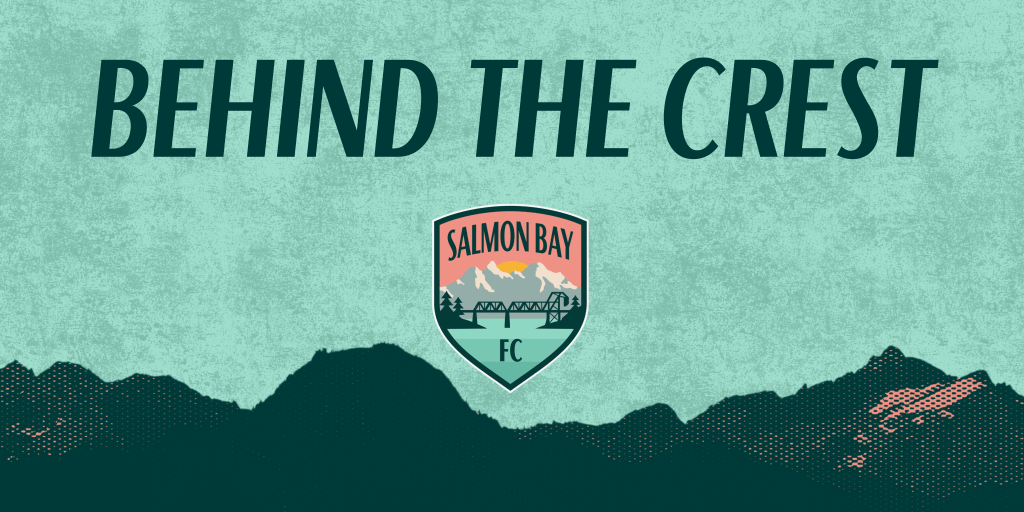
In addition to the team announcement, Salmon Bay FC also dropped their new badge and branding. Let’s take a deep dive behind the crest.
The crest was designed by Matthew Wolff, co-founder of Vermont Green FC and best known as a sports graphic designer and art director. Locally you might recognize “The Anniversary Kit” which he designed for the Seattle Sounders. Internationally, he’s best known for his 2018 Nigeria World Cup kit design, which was nominated for a Beazley Design of the Year award. Wolff has done work for Nike, the Seattle Kraken, two Major League Baseball franchises, and designed over two dozen soccer crests. We are incredibly honored to have Wolff design the crest and branding for Salmon Bay FC.
CREST
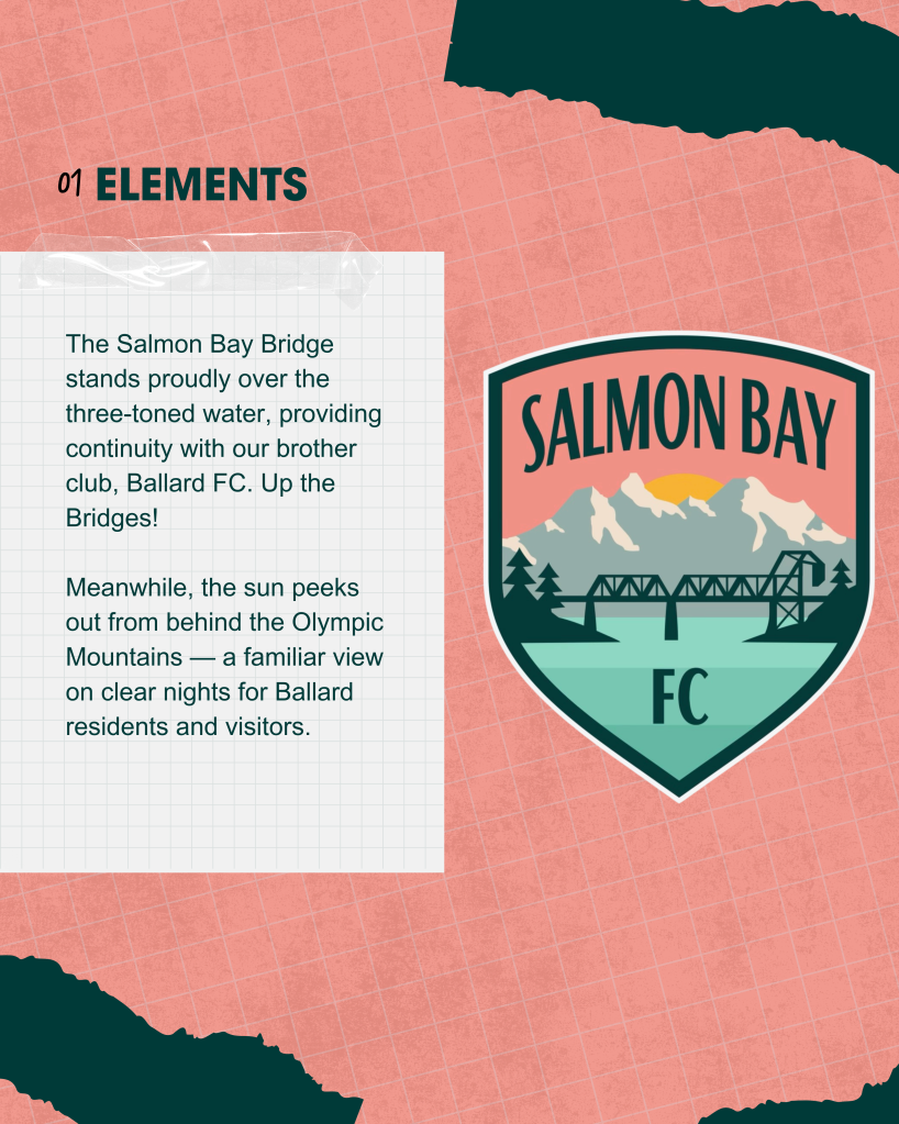
The crest depicts the Salmon Bay, the vital waterway connecting Ballard and neighboring communities to the sea just as Salmon Bay FC will connect local athletes to women’s professional soccer opportunities. The Salmon Bay Bridge is the focal point of the crest, standing over the three-toned water and providing continuity with the Ballard FC crest. The view of the Salmon Bay bridge as seen in the crest is what you would see from the Ballard bridge, highlighting the strength of “Up the Bridges!” as a motto for both clubs.
Beyond the bridge sits the Olympic Mountains, which is a familiar view for Ballard residents on clear nights. Specifically “The Brothers” mountain peaks are displayed, which is another connection to Salmon Bay FC’s brother club, as “The Brothers” kit was Ballard FC’s first-ever away kit.
COLORS

The color palette is almost entirely different than Ballard FC, helping create a new and distinct brand. Salmon serves as the primary color not only because of the club’s name but also to represents the sky which is painted salmon as the sun sets. The “forest green” that dots and surrounds the crest represent the trees that beautifully dominate the Pacific Northwest landscape. The mountains appear grey, the color one sees when looking upon the Olympics from afar. The teal water represents the color of the Fish Ladder at the iconic Ballard Locks.
WORDMARK
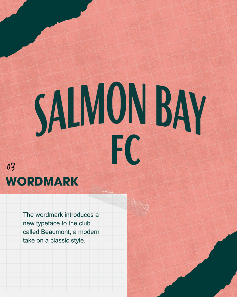
Lastly, our wordmark introduces a new typeface to club, BEAUMOUNT, offering a modern take on a classic style.
This wordmark, alongside our crest, provide fans with a variety fans with a variety of ways to showcase their support.
In addition to the crest, Wolff will also design the club’s inaugural kit which will release mid November. The kit is currently available in the Salmon Bay FC Ultimate Box, which you can pre-order today.


